Client Overview:
Tea Pot Publication is a boutique publishing house focused on curating intimate, thought-provoking literary and artistic works. With a vision rooted in quiet elegance and expressive storytelling, the brand needed a refined identity that could visually communicate its creative soul while remaining modern and minimal.
Challenge & Objective:
As a new entrant in a competitive niche, Tea Pot Publication wanted a brand identity that would feel distinct — neither too loud nor overly sterile. The goal was to strike a perfect balance between warmth and sophistication, making the brand recognizable across editorial, digital, and physical formats (like books, packaging, and merchandise).
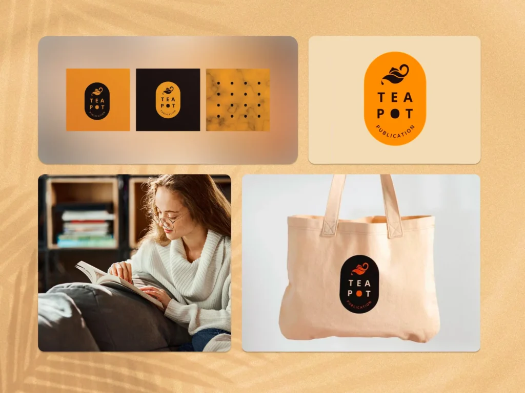
Our Solution:
We developed a visual identity that’s both memorable and poetic:
- Designed a versatile logomark shaped like a teapot, subtly dripping ink — symbolizing warmth, creativity, and the act of publishing
- Crafted a bold yet soft typographic system with harmonious spacing and shape balance
- Created a flexible color palette featuring burnt orange, cream, black, and soft neutrals — adaptable across print and digital mediums
- Delivered brand assets and mockups for real-world applications: tote bags, book covers, packaging, and editorial layouts
Results:
The new identity elevated Tea Pot Publication’s positioning as a premium, thoughtful imprint. The brand now stands out for its charm and clarity, earning early recognition among creatives and readers alike.